
My personalized Dance Recital book was written, and the illustrator had been selected, but she was not be able to begin work for a few months. It was then time to focus my attention on having a website built, which would serve as the principal retail outlet for my books. Because of the high degree of customization of my book, I knew that one of the D.I.Y. website building services like Squarespace simply wouldn’t work; I knew that I had to have the site built from scratch. And, custom websites can be costly, so I thought it would be wise to learn all I could about website development, especially since I knew nothing about the subject.
I began my research with Internet searches of “website design” and “website best practices.” I read a lot! I quickly learned that in 2013, mobile phone usage for browsing and shopping online, while still small, was growing rapidly. And, web developers had begun moving away from the practice of creating distinct websites for desktop and mobile. There was a big debate about whether adaptive design (which uses pre-set breakpoints and a query to determine the user’s screen size in order to serve appropriately configured website content) or responsive design (which uses grids that allow the content to freely flow and reconfigure as needed) was better. Another hot topic was, with the rise of mobile internet usage, the importance of designing websites for mobile users first, and desktop users second. I became very familiar with these concepts by reading posts by industry experts like Luke Wroblewski, Ethan Marcotte, and Brad Frost, as well as from resources like Smashing Magazine, w3schools.com, hongkiat.com, CSS-Tricks.
Considerations
Convinced by the experts that with a responsive website, I wouldn’t have to have a new one built in a few years, I knew that was what I wanted, and my next task was to learn how responsive websites were created. Several people I spoke with encouraged me to buy a WordPress template (some of which were responsive designs), but, my research showed that WordPress, because it is open source, is easily hacked; not wanting to deal with unnecessary security problems for my online store, I kept looking. As one might guess, I considered the large ecommerce platforms like Shopify, Big Commerce, and Magento, but I did not think that they would allow me to do everything I wanted with the site.
ZURB Foundation v. Bootstrap
I have to admit that I was a little frustrated that I couldn’t find an easy answer to my specific situation. With no choice but to persevere, it occurred to me that if I dug deeper into the subject of responsive grids, I might find a solution. It was this line of searching that revealed the two main frameworks used in responsive design: Bootstrap and ZURB Foundation. Not surprisingly, I spent a good deal of time on each company’s websites reading as well as on forums like www.stackexchange.com, and learned that one of the advantages of Bootstrap is that it is considered to be somewhat easier for a developer to get started with, compared to ZURB Foundation. The reason for this is that Bootstrap offers a lot of presets, which, according to some of the developers whose comments I read, tends to make websites created with Bootstrap appear theme-y, and identifiable as a “Bootstrap website.” As the creator of a highly customizable personalized book for kids, I didn’t like the idea of having a website that looked like many others on the Internet, so I read a little more about ZURB Foundation. That ZURB Foundation might have a bit of a learning curve for developers wasn’t really a consideration of mine mainly because I planned to work with a developer already well-versed in the framework. I was more interested in the fact that ZURB Foundation was completely customizable and my website would look unique. Even the pre-fab offerings, like buttons and orbit sliders, which save the developer time, can be tailored to one’s taste.
How I Ended Up Working With James Stone
Having decided that I wanted my website to be built using ZURB Foundation, I called ZURB, but their quote was not within my budget. I then resolved to find a sole web developer or small group with experience using the framework. Interestingly, my Internet searches did not yield any developers who specifically work with ZURB Foundation. But, on ZURB’s forum, I found three developers who offered tutorial videos on YouTube. Curious, I actually downloaded the framework and attempted the projects in the tutorials. (My kids still tease me about my coding skills; from time to time they ask me if I remember when I thought I could code and say, “Hey, look! I made a button!”) The videos were a good start, but I needed to learn more about the developers to choose one; again, I headed to the forums for more feedback. It was there that I saw the name James Stone frequently, and a few users advised other forum members to consult James with their questions, referring to him as the “Foundation Guru.” So, I emailed James and told him a bit about my bilingual personalized book project and asked if he’d be interested in working with me. Fortunately, he agreed to.
Building the Snowflake Stories Website
I was thrilled that James Stone had agreed to build a website using ZURB Foundation for my publishing company Snowflake Stories, LLC. In addition to being a great web developer, James is very attuned to his clients. He knew I was bootstrapping and suggested that, to save me money, I be the one to create simple wireframes to demonstrate the flow from one page to the next, along with a basic, shape-based design incorporating my color scheme. With a clear roadmap and my vision for the site, James quickly created a prototype—it was exactly what I had designed, but when I saw it, I didn’t like my design at all! My use of the three primary and secondary colors for a color scheme and geometric shapes made my design look like a kindergarten art class gone bad. I thought that lots of bright colors and shapes would convey that my website carried kids’ products, but, in practice, it was just loud and unappealing.
Back to the Drawing Board
For my second attempt at the website design (Website 2.0 as James and I have come to call it), I decided to stick with six colors, a different color as the backdrop for each of the six main pages, but this time, I selected icy pastel shades instead of the bold colors frequently used in designing children’s products. (Do you know how hard it is to pick six colors that work together? I found wonderful resources like www.design-seeds.com and Adobe Kuler, but every color palette I found had a maximum of five similar colors.)
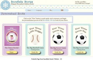
Now with a color scheme, what would I include on each page??? I knew that I did not want a typical website featuring kids’ products, which are often cluttered with more than a handful of things on each page screaming for your attention. Nor did I want one of those “hard sell” sites that overwhelm you with all of the products for sale on their home page. Knowing what I didn’t want, and nothing more, left me with a lot of blank space to fill, until it occurred to me to let my illustrator’s art, which is absolutely beautiful, be the focus of the various pages. In my attempt to highlight the book covers and related illustrations, I created panels with borders underneath Jelena’s art not only to add a bit of interest and color but also to break up the pages and help visitors to the website focus.
James seemed to think that the dotted borders I created and the main character’s denim jumper and a flower-printed top with ruffled sleeves gave off a sweet, and old fashioned or refined-country vibe, similar to that of paper dolls. And that became the design concept for Snowflake Stories’ website 2.0. I’m not a big fan of country design, but the fact that the website looked kind of homemade made sense because we really do create each book one at a time.
Customizing the Personalized Books
With colors and layouts for most of the page figured out, James and I turned our attention to the biggest challenge of creating the website, which was how to handle the book customization process. This was no easy task! We had to create a way for visitors to the website to:
Select a book
Choose 1-2 languages (from 5)
Select and Name each member of the book’s cast (up to six characters)
Customize the appearance of each character
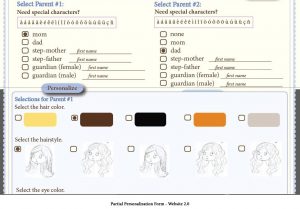
As Dance Recital’s author, I knew which possible characters the text allowed for, and as the book’s art director, I knew the possible physical traits for each of the characters. (For example, each of the characters have a certain number of hairstyles to choose from, and only certain characters can have wrinkles.) As a writer, I began with a list of open-ended questions. But seeing all of those questions on a screen was dizzying! (Unfortunately, I don’t have an image of the original questionnaire.) James reminded me that typing on a phone can be difficult, and suggested that we limit the number of opened-ended answers people could provide and instead, offer multiple choice options wherever possible. He also taught me how visual representations are much easier to digest than lots of words onscreen. So, my next attempt included images of hairstyles, eye colors, etc. (See image, right.) But, this format was still way too busy.
So, back to the drawing board yet again … The first change we made was to re-organizing the process of how people would build their books. Now, post-change, Visitors to the website are prompted to select a character (or two at most) and complete all of the customization of those one to two characters before selecting and customizing the next character(s). Since building a book is a multi-step process, we needed a means of guiding people through the process to keep people from getting confused about where they were in the book building process or which character they were customizing. The solution was a navigation bar, which also serves as a progress bar. If people want to jump around in the process, they can simply by clicking on the appropriate step in the bar at the top of the screen. Additionally, the navigation bar shows people exactly where they are in the book building process as well as how many steps they have completed and how many remain. This feature is especially nice for anyone not familiar with Snowflake Stories’ book building process.
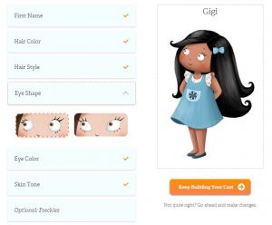
After several conversations about how we could present one question at a time, James showed me a prototype for what would become Snowflake Stories, LLC’s proprietary Character Builder. Initially, it was so sparse that there weren’t any words on the screen at all! There were no instructions, and, there were icons instead of words representing the each category of physical traits. As a writer, that was a little shocking to me. And, while I liked the clean, organized feeling, I needed words. So, I wrote a few lines of text, and James swapped out the trait icons for words, and voilà! We had an organized, easy-to-use format for tailoring the appearance of each character.
The only other decision big decision was whether or not to show the character before it was completed. James began this discussion by telling me about two common practices on the web: using pre-sets, which people are free to change, and showing the work as you go. I thought that if people were to see a character with all of the traits selected, they might not understand that they could change the options. Regarding the “show as you go” option, in theory I liked the idea of seeing how each selection helps to create a character, but I didn’t think that the implementation would be graceful. My idea was that people ought to see their character only after making all of the trait selections. James’ only objection was that he thought it might be confusing to have nothing on the screen other than the categories of traits to be selected, and he suggested including a silhouette of each character. Clearly, a lot of thought went into designing Snowflake Stories’ proprietary Character Builder, but it was worth it—the selection process is really intuitive and fun to use.
Website 3.0 – The Redesign
As the company began to grow, I became a little self-conscious of my homemade design and felt that we needed a more polished website. So, in December of 2015, James brought in Marcus Handa for a design overhaul of the website. The old design was sweet, and, after all the hard work and countless hours we spent creating “Website 2.0,” I really was sad to see it go. But, I’m thrilled with the new design! Somehow, Marcus was able to modernize the paper doll concept. He used dotted lines and a simplified the color scheme not only to separate different ideas on a page, but also to provide a clean backdrop. He also pared down some of the visually-weighty elements. The end result is a sweet, yet clean, modern, and easily-navigable new website. If you haven’t seen the latest version of the website, check it out: www.SnowflakeStories.com.
Just like the business, the website is a work-in-progress. We’re always tweaking the copy and adding features. Be sure to check in regularly to see how we’ve grown. And, any suggestions on how we could improve the website’s user experience are also welcomed; just fill out the contact form on the Stay In Touch page.